Visualizing Inequality
Help me pick the cover for my book! (Scroll to end for poll.)
How do you see inequality? The answer is not as obvious as it might seem because we see the results of inequality all around us. For example, we see extravagant amounts of wealth on display across the landscape. There’s the Forbes 400 list of the richest people in the United States, media stories about weddings that cost upward of $50 million and are attended by a cohort of celebrities and the ultra-rich, and an entire genre of videos on tik tok and elsewhere dedicated to people buying Birkins. Looking in a different direction, we hear stories everyday about people losing their jobs and government benefits, people struggling to find affordable housing and healthcare, and people bridging the gap between paychecks with payday lending and high-interest credit cards.
But to actually see wealth and poverty together and understand the size of the gap between wealth and poverty is rare. The most common way that people visualize inequality itself is through charts, maps, and graphs. These visuals can tell us a lot about wealth gaps, education gaps, and even gaps in access to things like clean water. One of the most well-known inequality markers, which can be charted across countries or time, is the Gini coefficient.
But graphs and maps cannot tell us the whole story of inequality, and we need narratives and images in order to help us understand, contextualize and find emotional access to the dynamics of poverty and wealth. When we look to art for images of inequality, we once again find siloes- either pictures of families and individuals living with great wealth and images of people living in poverty. It’s hard to visualize the contrast rather than the results for each population.
In my forthcoming book, The House that Family Money Built, I use the metaphor of a house (building on the one used by Gargi Bhattacharyya) to talk about what inequality looks like. Here’s how I describe it in the book:
The traditional house of family money was governed by a set of direct rules dictating who could inhabit what spaces and that staff could only occupy certain rooms and at certain times. The labor of the staff directly enriched the life of the living room occupants as they brought them tea and sandwiches, washed their clothes, and cleaned up after their parties in exchange for minimal or no wages.
In the family home remodel, all the parties supposedly have access to the living room, where there are comfortable couches, good lighting, bowls of fruit on the table, and books to read. Nevertheless, some families cannot access the living room because the connecting hallway is closed or they have been waylaid by a falling debris from the ceiling. The occupants of each floor, subject to rules that are supposedly more egalitarian, still rarely meet. Moreover, through new circuits, the labor and other resources of the downstairs residents wend their way into various forms of benefit for the living room residents, albeit less directly than before.
Based on this understanding of the house of family money, here are the five top contenders so far for the cover art. I’ve written a little about why I like each one, but I’d love your thoughts. So please vote and comment (including if you don’t particularly like any of the choices) - and send suggestions for other possibilities as well.
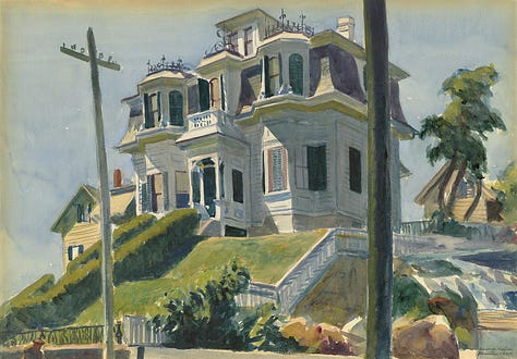
#1. The house on the hill. This is an Edward Hopper painting (Haskell’s House, 1924) and I like the architecture and the location on the hill, which suggest timelessness, removal and wealth, combined with the power lines, which suggest something different - an entanglement with modern realities and urban life.
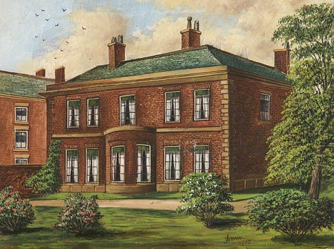
#2. The colonial. This is a 1905 painting by James Shaw of Colonel Hutchinson's House and Garden, in Silver Street, Bury. For me, it evokes the traditional structure of wealth and represents the template which still informs our framework for family money rules. It also evokes money with a colonial or imperial past.
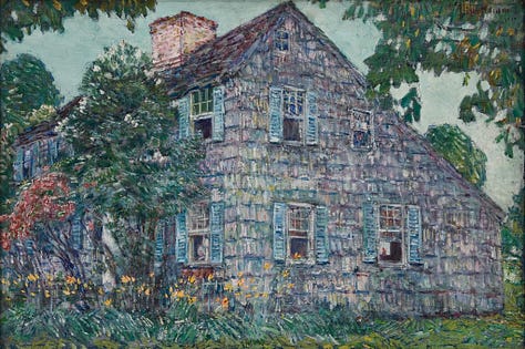
#3. The old house. This is a Childe Hassam painting from 1917. I like it because it speaks to the conclusion of the book, which is about building a house that is workable for everyone, discovering new corners, and building gardens.
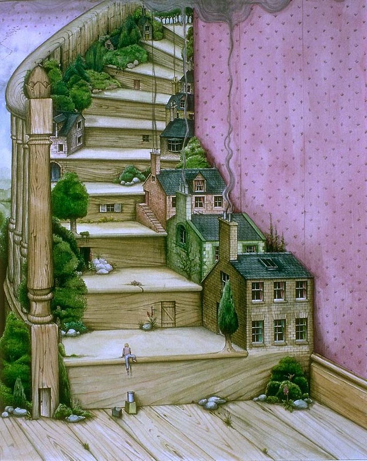
#4. The stairway. This one is appealing because the stairs are a nod both the social mobility as well as an upstairs/downstairs system.
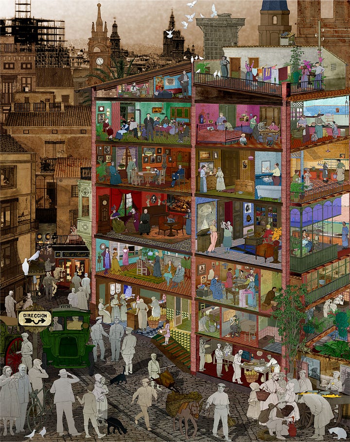
#5. The cross-section. I like this one because it gives a cross section of a house with a great variety of rooms, with workers on the ground floor and settings defined by greater wealth above. You get both ends of the wealth spectrum in one image.


So torn between the house on the hill and the cross section! Great options.